Services
- Brand Strategy
- Visual Identity Design
- Promotional Design
- Point of Sale (POS)
Overview
Oz Stone Warehouse manages the entire process from Indian quarries to its Australian warehouse, distinguishing itself from typical building-supply merchants. Their product is a refined architectural material, and the brand needed to reflect that sophistication.
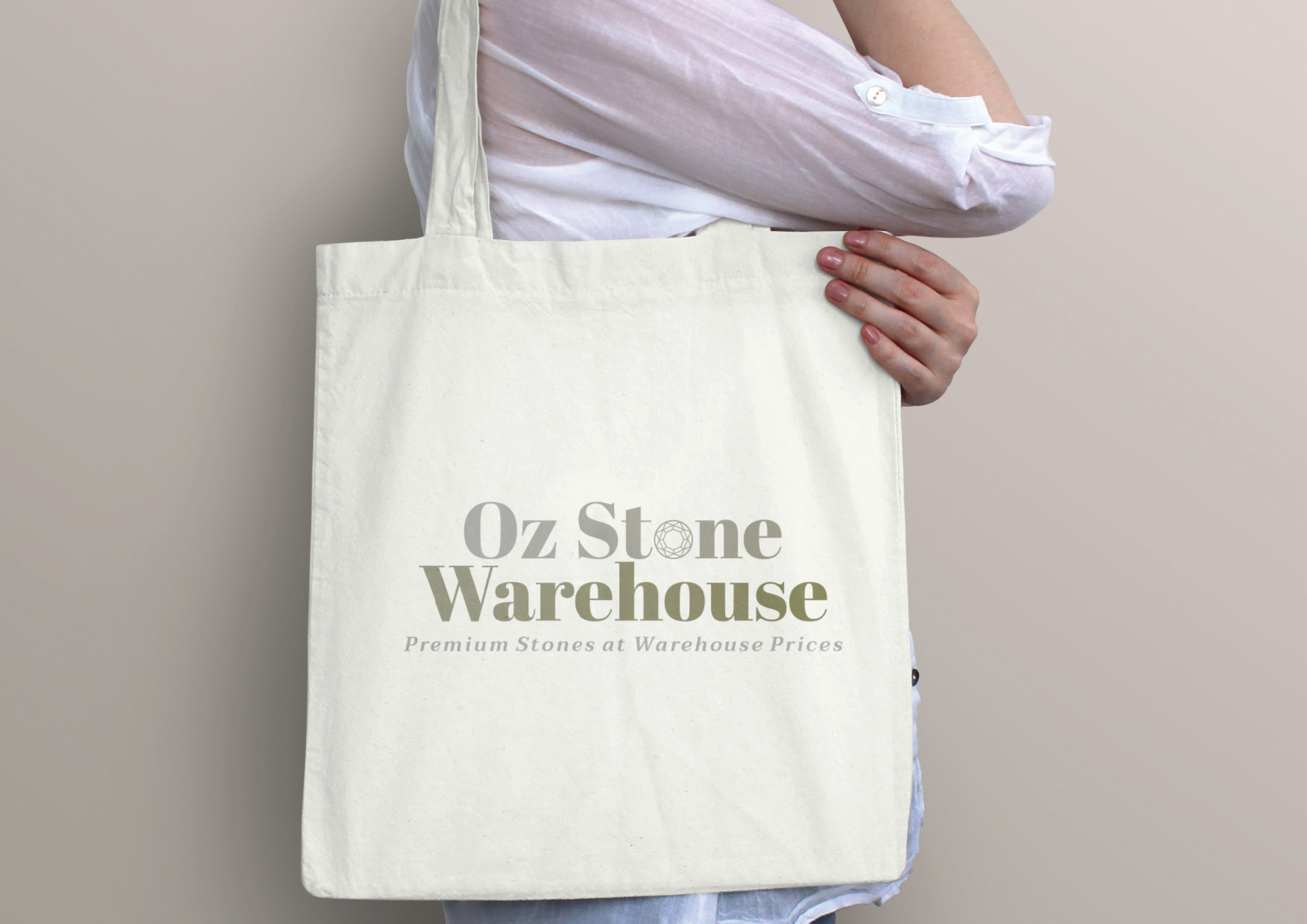
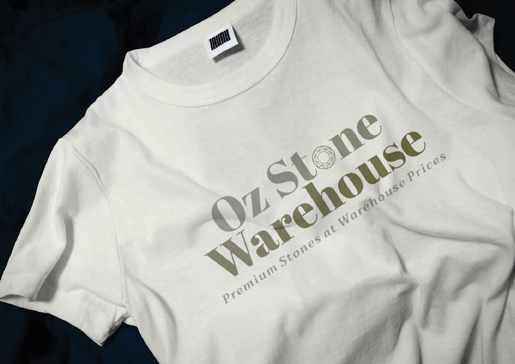
Oz Stone Warehouse no longer looks like a standard warehouse. Explore it for yourself.
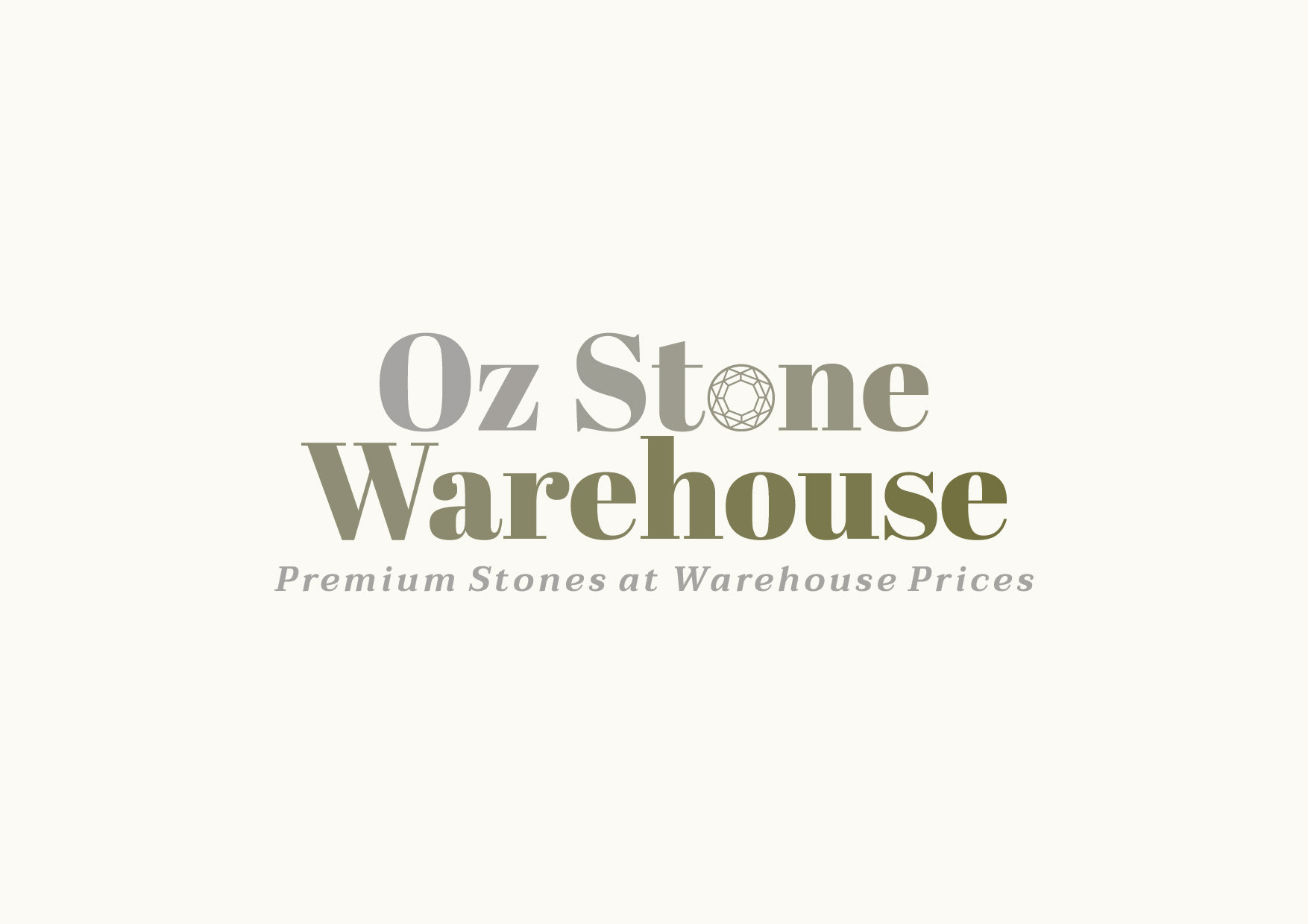
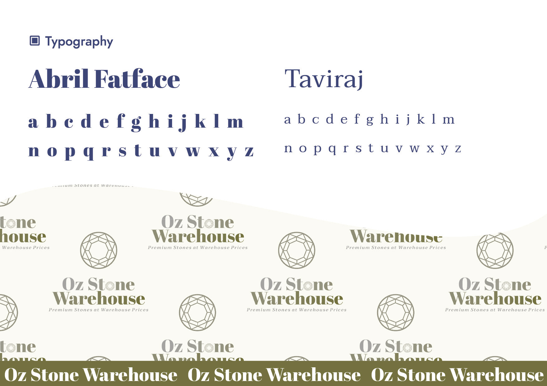
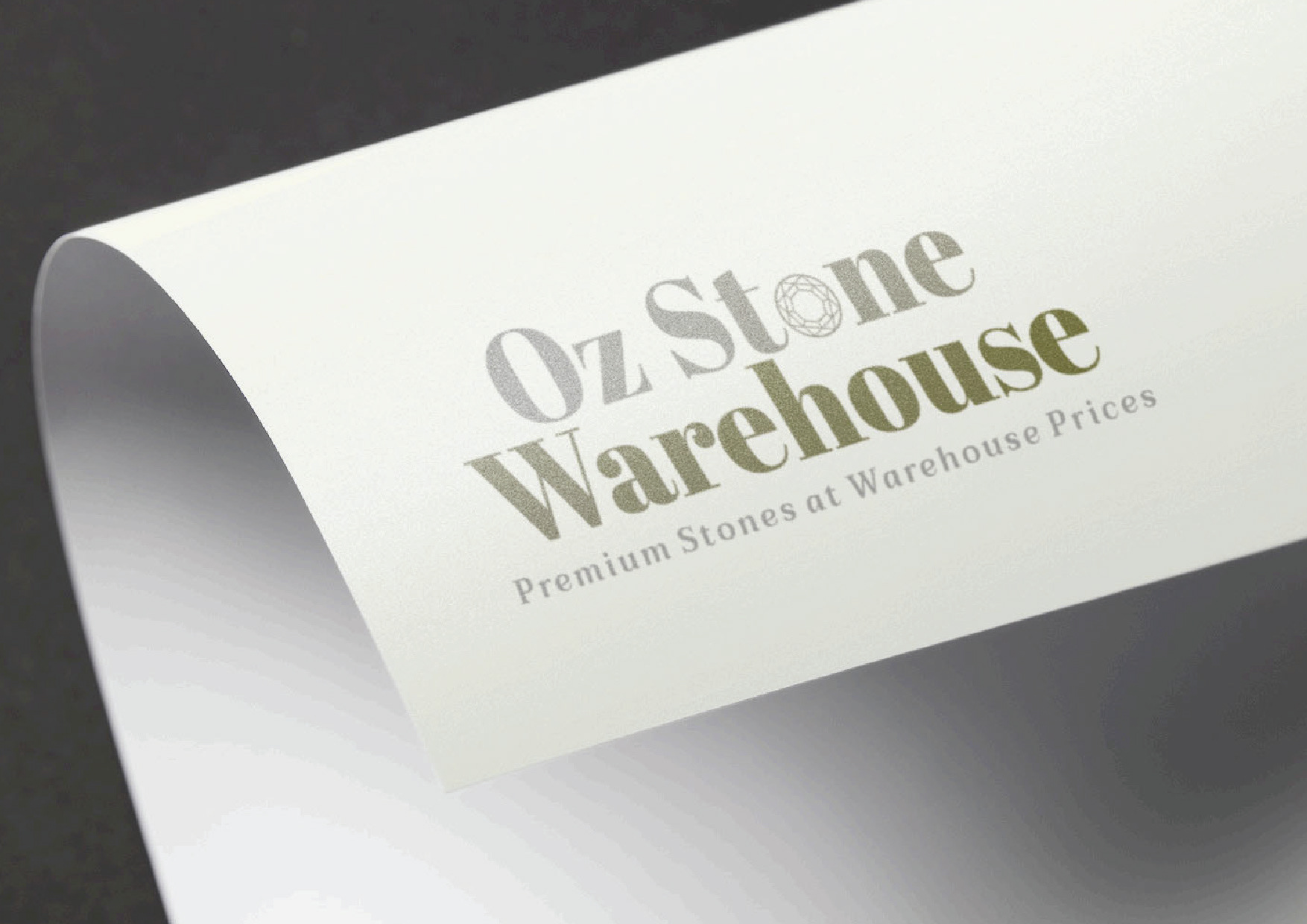
The design features Abril Fatface typography for its bold contrast and elegant curves, conveying luxury in a field often dominated by industrial sans-serifs. The logomark includes a geometric stone icon, elevating the product's perception from raw material to an architectural element.
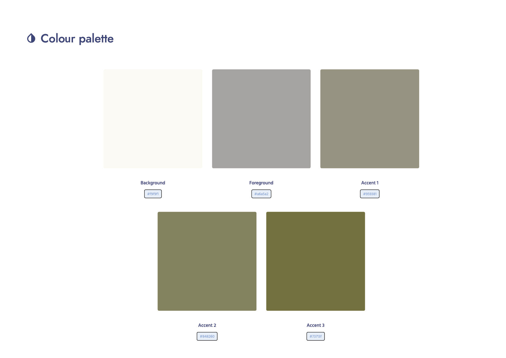
The colour palette avoids harsh blacks and bright colours, opting for Slate Grey and Moss to emphasise sustainability and ethical sourcing. The result is a brand that mirrors the quality of its products
Do you need a brand identity that positions your business above its competitors?
Let's talk about how design can do the heavy lifting